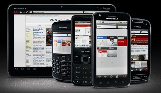
A lot of business owners are still trying to understand the importance of having a separate mobile landing page that will be compatible with most smartphones and cellular phones today.
Aside from developing a mobile page for their businesses, they also have to make sure that the page is optimized according to SEO standards and consumer satisfaction as well.
If you ask the experienced programmers, having a mobile page is necessary because most people are now using the internet through their smartphones. You have to make sure that your page will be readable through a mobile device.
To optimize your mobile landing page, here are the things that you can do:
- Place all important links on the front. The front page of your mobile landing page is what the customers immediately see when they click on a link that leads to your site. Since mobile devices have limited screen sizes, you need to make sure that necessary links can be found on the first page. You can bring them to your shop, to your services section, and even to your contact information page.
- Make important elements visible. Because of the limited screen size, you need to find a way to make important elements pop out. This is where the web design will be necessary because you need to focus the attention of the customer to certain parts of the page through the design. It will be imperative to create a special design for your mobile landing page while following the similar theme of your original website.
- Add short and simple content. People do not really like reading long paragraphs especially because the phone has a limited screen size and they would have to scroll down to read the entire thing. So the best thing that you can do is to write short yet straight to the point paragraphs to make your thought easily understandable. You can add a link where they can be brought to a page for additional reading but the main points should be very simple and straight forward on the initial page.
- Superb Navigation. One aspect of a mobile site that can really turn off customers is poor navigation. If the consumers cannot easily find the page that they are looking for, they easily leave your site and go to the other brand. With easy navigation, customers can be brought to the page where they can find your products easily, they can choose, purchase and checkout quickly as well.


