

Colors are very powerful. They have the capability to evoke different thoughts and emotions from the people who are seeing and experiencing them. This means that they have a great potential to be controlled in order to acquire a specific reaction that you are aiming for. This is especially true for those who design websites. If you know how to mix and match colors, it will definitely contribute to the surge of users that visit your website. All you need to do is to familiarize yourself with controlling the color output in your website.
When choosing colors for your website, always consider your content. What you are trying to sell here is the stuff that people read and see – in other words, text and graphics. Make sure that you use text colors that are readable against the background from where it is placed. Do not allow the text to blend in with the background because your visitors will not be able to read it. Commonly used colors for text are black and white – black works with lighter backgrounds while white or any grayish tone would suit darker backgrounds as they tend to stand out. Your pictures should also pop out so go for saturated background colors to highlight them further.
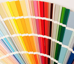
Another important factor to consider would be the concept of chronic harmony. This refers to the colors that you add in your palette for your web design. As much as possible, settle for 3 colors as your base hues and use them alternately on your website. This helps make your website less disjointed in terms of color schemes and will reduce the chances of shocking and confusing your visitors whenever they navigate your portal. A good technique to consider for chronic harmony would be opacity. Reducing the opacity of a color creates a lighter tone and another hue but it does not stay away from the scheme that you are utilizing.
The colors that you use for your website are also dependent on the product that you are selling. For example, using red and yellow colors on a food blog would really be effective as these colors help induce appetite among viewers. Architecture and interior design-based websites can use minimalist layouts wherein white and other softer colors match well. By mastering the art of color selection, your websites become more effective and ideal results will be met and even exceeded.