

Choosing a website color and a color for your logo is one of the most important things when opening a business. There are also web development agencies that can be considered cheaper if you want your website made by them. Questions will be asked of you when you hire an agency or a company to make your website, and by then, it would be easy peasy.
In selecting your website colour, your favourite colour would be one of the best options. But if you love the colour pink, and you plan to put up a restaurant, you might want to think it through. There are colors fit for each business enterprise, and it’s shown to be effective in picking the color that best fits in each business.
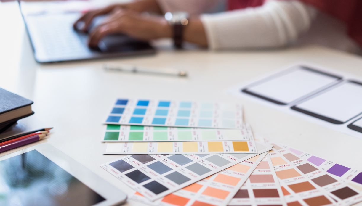
A lot of business owners don’t believe that the website scheme helps the business. They don’t think that it’s important because customers value the nature and products of the business rather than choosing which color to choose for a logo. And a lot of you might not know that each color represents a stimulant in our brain.
An example of a well-created logo would be McDonald’s. McDonald’s is known to be one of the most well known multinational fast-food chains. A lot of people love it because the food is cheap, delicious, and served quick. Another reason why people love it is because of the color of the logo.
The first color you’ll notice is the color red. The color red is believed to make you active even if you’re tired and can make you hungry. Being active raises your heartbeat, which stimulates your appetite. The yellow is associated with being happy, that is why the meals with toys are considered a happy meal. No matter what time it is in the day, yellow can be easily seen because of its brightness.
The brain processes color faster than shapes, words, and symbols. If you want your business to be big, you should consider color in the logo.
Choosing the background
If you choose a background color for your website, it shouldn’t be too bright or too dark that customers find difficulty reading the context. If you want to have a dark color, you can do backgrounds with dark and light colors. Usually, retail stores purposely use daring colors to attract customers.
Customers feel comfortable and relaxed when they are strolling through an aisle with a light atmosphere. Using cool colors has advantages such as a relax and chill atmosphere, and items are easy to classify.
The main thing to consider is for your customers to focus on their online or in-store shopping experience. And there are different colors suitable for each industry that you should know about.
Primary color
It might be a bit risky, but you also want your customers to remember you. If you haven’t got a logo, you can choose one of the primary colors so your logo can pop and be dominant looking.
Know which color best suit your business. Some colors attract age groups, and you can have that as a base for your target market.
The following are the meaning of colors in an industry:
- Black
Black is well known to be a luxury brand color. You can also go well with other different colors with this color. A simple black and white scheme already screams power and strength.
Some companies combine all tones of black, and it still looks cool as a design. There are a lot of things associated with black, such as goth, death, and punk.
- Red
The color red in a logo signifies a lot of meaning: Love, Sexuality, Violence, Passion, Fire, Heat, etc. Since it is a warm color, the color red is usually used in restaurant logos or fast-foods and is combined with yellow and orange.
Science says that when a person sees red, it makes them hungrier, which leads them to buy foods. A way to attract customers is to make the color pop, it may take a lot of tries to pull it off, but it is worth it if you nail it.
- Brown
The color brown is associated with simplicity, decadence, nature, practicality, etc. Brown is also an earthy color, which is why coffee and chocolate companies use this color. Nature and bio-degradable packaging are also associated with brown.
- Pink
Femininity, LGBTQ+ community, sexuality, and love are associated with this color. Pink colors are usually used in young girls’ toys or usually products for females. The color gives off a less intense look, unlike red and purple.
- Blue
Blue is mostly associated with authority and stability. There are a lot of big companies that use blue in their logos and websites. Most of them are technology companies such as Samsung, Intel, HP, Dell, IBM, etc.
Many corporate companies use blue since it signifies professionalism and cleanliness. A lot of people trust the color blue, that is why technology companies use them so people can trust them with their pieces of information. Phones, laptops, hard-drives, etc. are quite expensive too, that’s why people hesitate to buy.
The blue color is also associated with beverages like water. The color gives it refreshment along with soaps, hygienic products, and toothpaste.
- Green
The first impression that crosses our mind when we see green is nature or the environment. Green also symbolizes refreshment, health, comfort, nature, and money.
Current companies who also use green are banks since it’s affiliated with money and safety or security. Pharmaceutical companies and insurance providers also use green because you easily trust the color with your health and money.
One of the main reasons why people use green is that it looks organic or nature-friendly, which is a trend these days to preserve the environment.
- Orange
The color orange gives off a more youthful vibe. The color has a similar meaning with red such as fire, energy, and heat, but this appears on more autumn season and more friendly and fun color.
Nickelodeon uses orange and white in its logo. If you are not familiar with Nickelodeon, they’re a children channel that shows cartoons and teen shows. The only thing to worry about using the color is it’s commonly associated with Halloween.
- Yellow
The lively color, yellow, attracts attention since it has a light hue. If you are wondering how it is attention-grabbing, you should look into companies that use yellow in their logo. You should also consider the color of taxis in some cities or countries.
Yellow is also associated with clean, comfortable, optimism, and caution. A lot of companies use this color as cleaning gel or powder. It comes handy because you can disguise the yellow color as a lemon scent.
- Purple
Royalty, flamboyance, wealth, elegance, femininity, and nobility are associated with this color. We don’t see much of purple in a logo since it is associated with wealth and royalty and for people, just by seeing it looks expensive.